by RichardC
Client: The Light Project
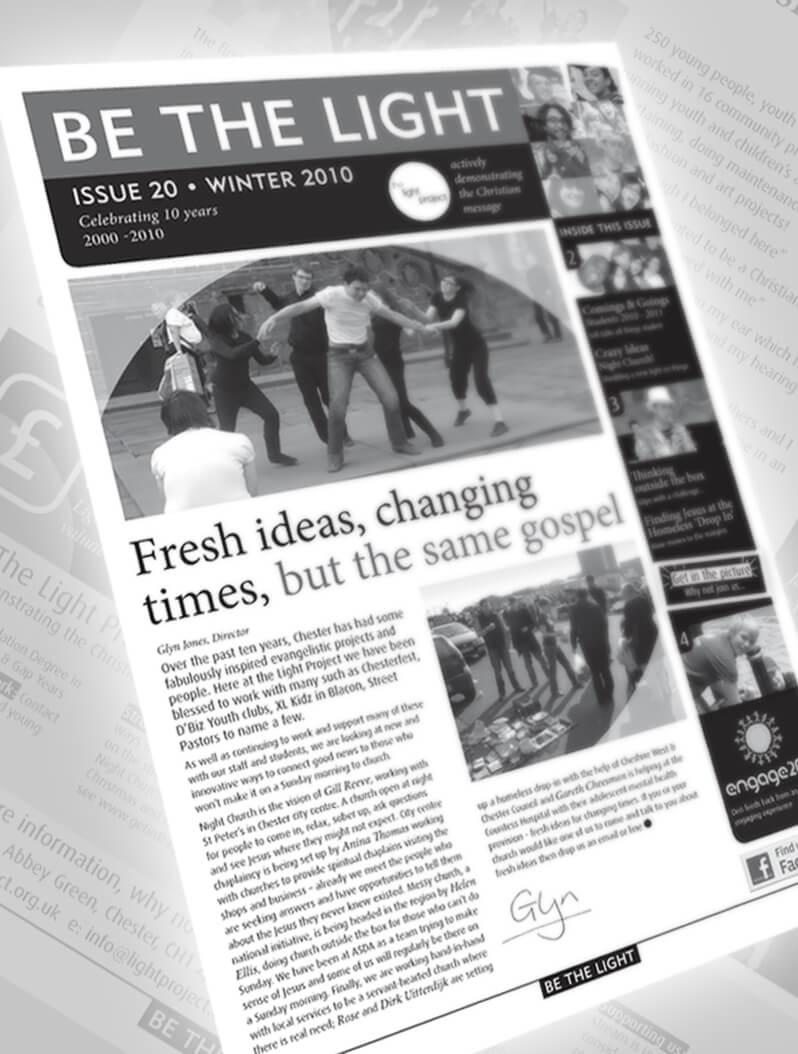
The Light Project has a newsletter that they regularly send to supporters. They wanted to upgrade its design to better reflect the organisation’s professionalism.
The response has been excellent with supporters donating more money to support the work.
by RichardC
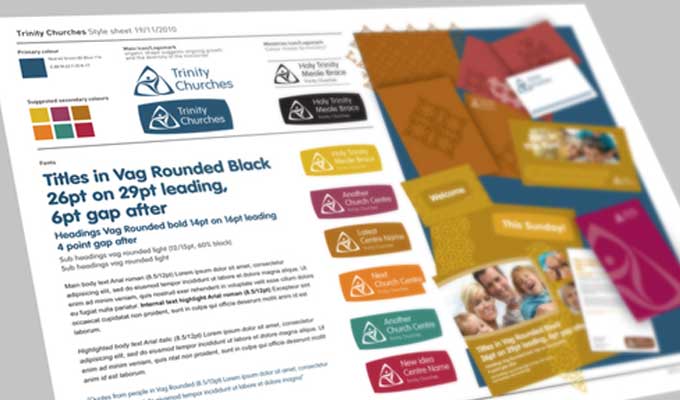
Trinity churches approached us with the need for an identity for three separate churches to be able to work together under.
Through discussion we developed a brief that would form the basis of their identity development.
Brief: (buzz words) Ambitious, contemporary, confident, fun, playful, professional, family feel, linking people together, confident, thriving, clarity.
Other comments: flexible enough to use with the creation of new ministries. Perhaps some sort of transferable icon…
We were than able to suggest logo ideas to develop into a final idea alongside creating a style sheet as a reference point for all their future communications.
The style sheet we created included the final logo, primary and secondary colours, fonts, image styles, tone of voice (in the copy).
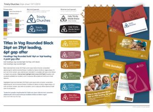
It’s since been referenced to create signage, leaflets and their Connect2 magazine. All their communications reflecting and reinforcing their identity.
by RichardC
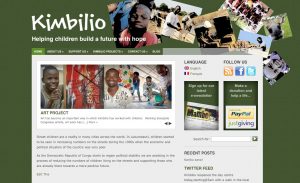
Client: Congo Children Trust
The Congo Children Trust approached us for an online presence for the Kimbilio children’s centre project in D. R. Congo. The site needed to be bi-lingual (English and French) and to be fully integrated with Facebook and Twitter.
Deliverables
We provided them with a comprehensive web site which they can easily update themselves. This ensures constantly-fresh content and very low maintenance costs.
We also supplied an e-mail newsletter system which allows them to send regular bulletins to subscribers, in English or French, at the click of a button.
by RichardC
CD/Download cover for World Music Ministry’s Ruth Anne…

by RichardC
New logo for World Music Ministry created for Ruth Pollard.