Making a contribution
Case study:
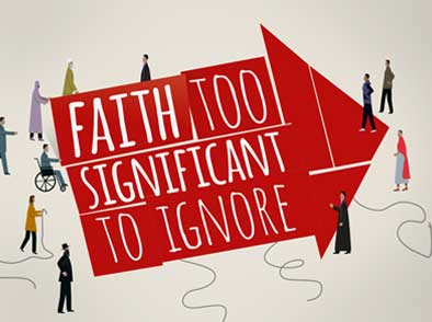
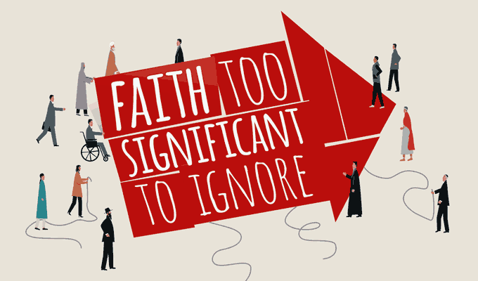
FaithAction. Because faith is too significant to ignore
FaithAction: Creative Brief outline
Any identity project starts with working with the client to clarify the idea, the vision, the mission. The why, how and what you might say.
FaithAction fund, train, advise, campaign, research and innovate. Working nationally to support faith based organisations at work in their local communities.

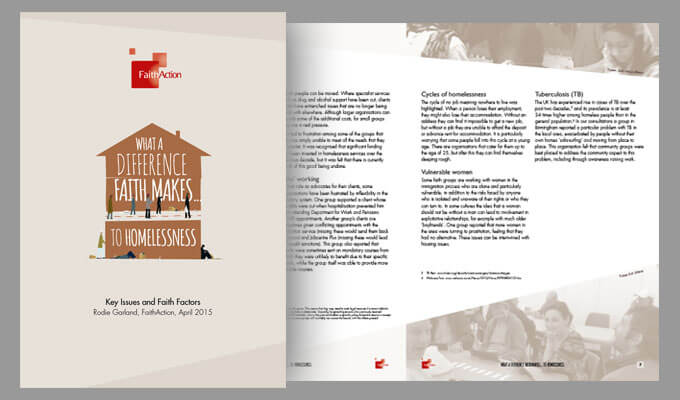
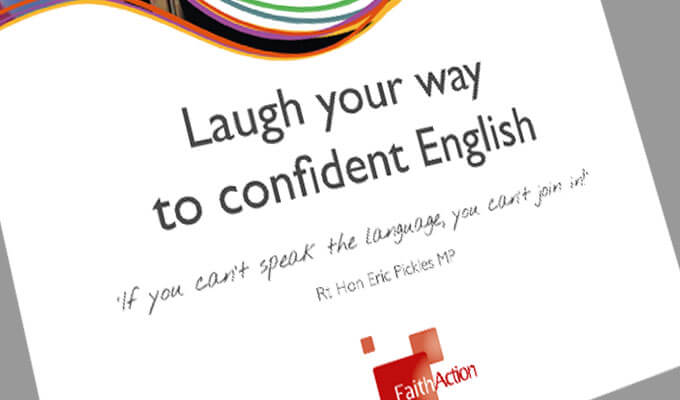
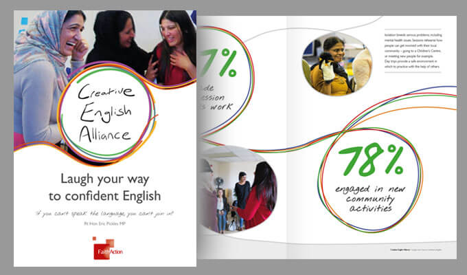
Through their guidance and training 140 organisations have pledged their commitment to helping people who suffer with mental health problems, and their multi-faith social action initiative has resulted in 58 community projects engaging over 577 individuals… with the Creative English project has engaging over 2400 people in learning English through drama and role-play.
I’ve had the pleasure of creating a new look to their literature over a number of projects and, in a small way, feel like I’m playing a part in building a better society! Now that, I can believe in.
Deliverables
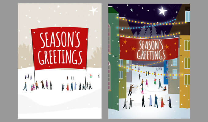
Promotional literature Illustration
Print handling