Developing community

Developing community

Case study:

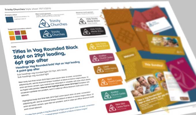
Trinity Churches: Developing community

Trinity Churches: Creative Brief outline

Any identity project starts with working with the client to clarify the idea, the vision, the mission. The why, how and what you might say. 

Through the process of developing the brief, we discovered we were aiming for something contemporary, confident, professional, family feel that reflected linking people together in this thriving community. They run a range of courses, events and services to encourage and support their local community. in all a good thing.

Trinity churches are three separate churches working together in Shrewsbury. They were looking for one identity to work together under that would be flexible enough to use with the creation of new ministries.

And everybody said…. amen.

Deliverables

Logo
Identity style sheet
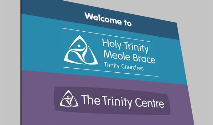
Signage
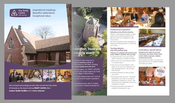
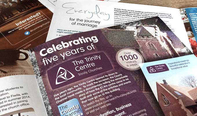
Promotional literature
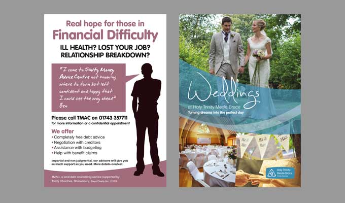
Marketing materials
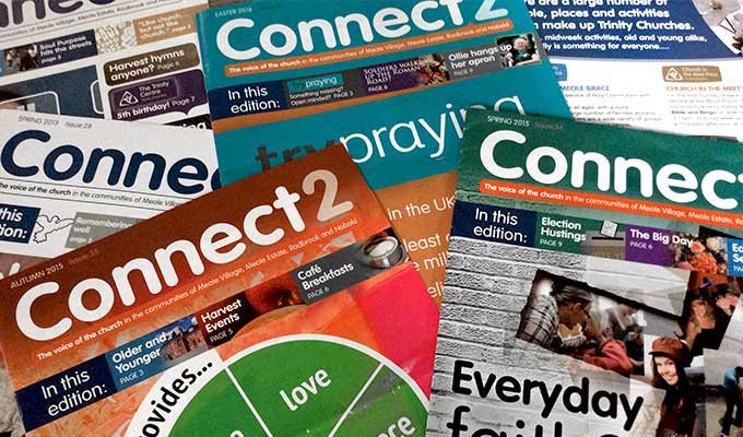
Quarterly Magazine

Warm and friendly

Warm and friendly

Case study:

Logettes. Wood burning briquettes

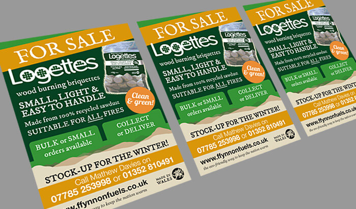
Logettes, a small wood burning briquette that’s set to make a big difference.

As a company who wanted to communicate their Welsh heritage and their unique, product, Ffynnon fuels needed an identity for both themselves and their first product, Logettes – wood burning briquettes.

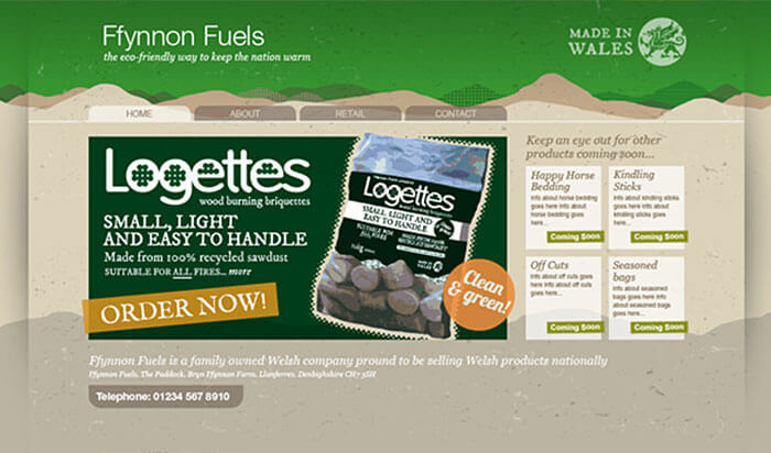
The main point of difference with Logettes is their size… being smaller makes them easier to handle and useable in all fires. We used the circular Logettes shape within the letters in their name to emphasise this, as well as the Welsh hills as part of their wider identity. Made from 100% recycled materials too.

They just leave you with a happy glow all over.

Deliverables

Logo
Identity
Website concept
Advertising
Packaging

Make your mark

Make your mark

Case study:

Carey Adams Strategies. Make your mark.

The Larch Cladding Company: Creative Brief outline

Any identity project starts with working with the client to clarify the idea, the vision, the mission. The why, how and what you might say. 

Carey Adams wants you to make your mark. Not necessarily with a pen you understand, but by uncovering your skills and talents and helping you find your place in the world by being the person you were created to be.

Through our discussions we established ‘Carey Adams Strategies’, or more specifically Carey, has a tailored, flexible, responsive, personal, focused approach to career coaching, and a real passion for helping people identify their talents and their place in the wider world.

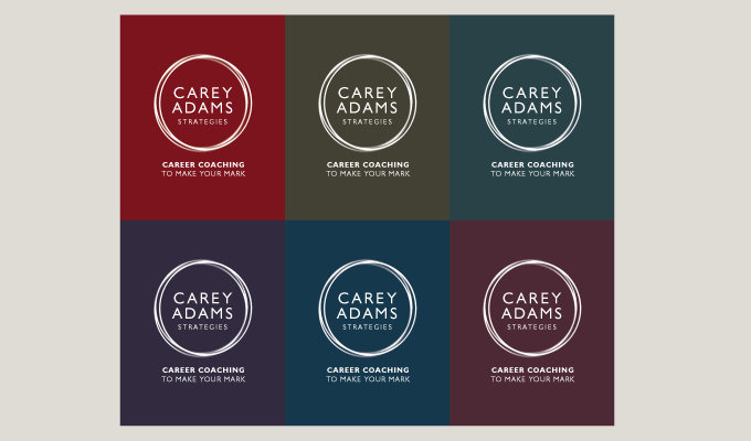
The type of line used for the circles on the logo and the idea of using a palette of colours as a base to the logo helped communicate these attributes.

We all have a destiny folks. Carey’s the man to help you find it.

Deliverables

Logo
Identity ideas
Business stationery
Literature
Signage

Just a quick note to say the logo and stationery is brilliant. Love the simplicity with the range of colours communicating ‘variety and diversity’ – just what I wanted. Thanks for taking the time to get it right. A really interesting process too.
Carey Adams

Owner, Carey Adams Strategies

Creating a safer world

Creating a safer world

Case study:

Silmetric. Creating a safer world.

Silmetric: Creative Brief outline

Any identity project starts with working with the client to clarify the idea, the vision, the mission. The why, how and what you might say. 

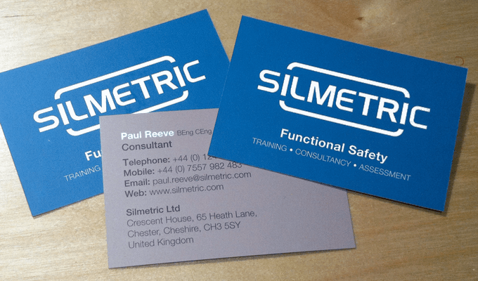
Silmetric are functional safety advisors. They work in industry, advising, consulting and training businesses about creating safe systems and environments.

Phrases that came through our discussions were; identifying strategies, adding to or interrupting existing processeor procedures and bringing clarify and focus to the technical end of rugged industrial safety. 

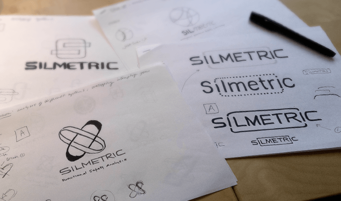
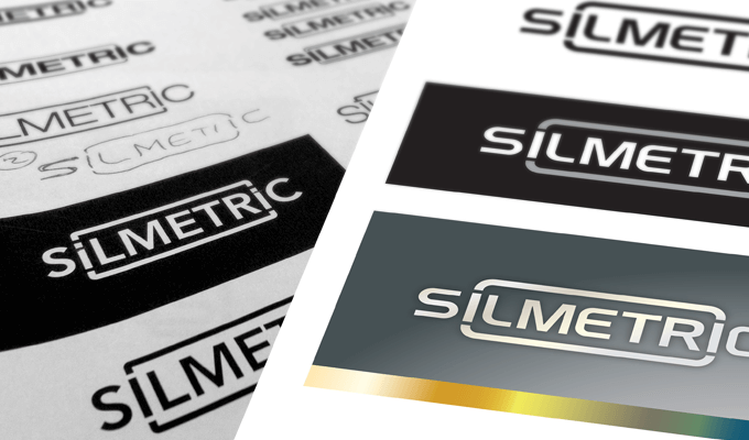
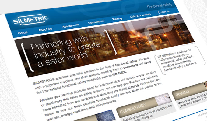
Therefore their logo looks to suggest the notions of linking in with an existing procedure (shape) and has been kept clean as its aimed at engineers and the technically minded.

The notion of Focussing on a part of the bigger picture, was quite unique to them and is partly expressed through the use of short focal range photography, and potentially in the size the logo is used (perhaps slightly smaller than usual).

Indeed they are ‘Partnering with industry to create a safer world’. No arguments there then.

Deliverables

Logo
Identity style sheet
Business stationery
Website
Power point slides

Richard did a brilliant job in creating our company logo, identity and website graphics which lots of people in my industry comment on. Since the company was launched, I have used Richard to create PR material, training and exhibition roller banners. His eye for detail and his professional results mean I would not go anywhere else.
Paul Reeve

Director & Principal Consultant, Silmetric Ltd

A lifeline

A lifeline

Case study:

The Hub. Being part of the solution

The Hub: Creative Brief outline

Any identity project starts with working with the client to clarify the idea, the vision, the mission. The why, how and what you might say. 

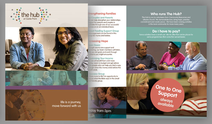
Not just a Church with a big heart trying to influence the world around them, but also a network of partnerships built to empower people locally, nationally and globally, and a project with a vision is to equip people for life and work, delivering services that recognise the importance of the whole person, whole family and the whole community.

LifeLine were looking to develop a logo and identity for their project The Hub.

A pleasure indeed.

Deliverables

Logo
Identity
Literature
Stationery

Richard has proven his versatility in design over numerous projects. He listens carefully, follows through diligently and works with speed. Brilliant.
Anthony

Lifeline Projects